
Times New Roman might cost you your next job.
While resume font choice may seem trivial, experts say it's actually pretty important. A bad font can take the focus off the accomplishments you've listed.
"A reader may not arrive at the content if your font if too distracting," Samantha Howie, senior human resources recruiter at the New York-based Maximum Management Corp., told the Huffington Post. "The key is that we can read it with ease."
Drawing upon Howie's recruiting expertise and tips from a typeface expert, we've composed a definitive list of the best fonts to use on your resume. Spoiler alert: The days of using Times News Roman have come to an end.
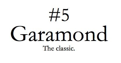
For an elegant feel, Garamond is the one. "Garamond is very readable," Howie told HuffPost. "But for me, it feels a little bit old fashioned, or perhaps not as corporate."

Howie approves of this widely popular font, calling it a "safe bet." Typeface expert Brian Hoff, creative designer at Brian Hoff Design, agrees. "It's very neutral," he told HuffPost. "It's clean but doesn't have much of a way about it."
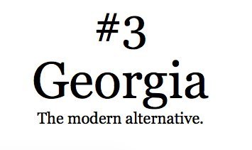
"It has the same positive attributes as Garamond, but for me doesn't feel as dated because it is less curvy," Howie said of this font. However, Hoff said that Georgia tends to appeal more on the Web than it does in print. So if you're going to distribute hard copies of your resume, think twice about Georgia.
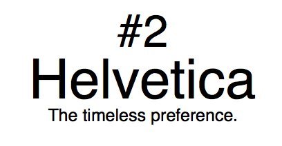
"It's a no-fuss typeface that has a timeless feel to it," Hoff said. Howie mentioned that Helvetica is popular at the recruiting firm where she works.
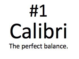
Modern. Tasteful. Professional. Interesting. "Calibri really does it for me -- it's my personal favorite," Howie said. "It's clear, readable, straightforward but not lacking in personality." In Microsoft Office 2007, Calibri replaced Times New Roman as the default typeface in Word and replaced Arial as the default typeface in PowerPoint and Excel.
Of course, some typefaces are absolute negatives. Comic Sans, for one, should never be considered, according to the experts we interviewed.
"Comic Sans was literally created for comic books," Hoff said.
"In the professional world, it is totally inappropriate," Howie added.
Times New Roman, a font praised by high school English teachers across the country, is not so warmly received in the professional world, either.
"It's telegraphing that you didn't put any thought into the typeface that you selected," Hoff told Bloomberg News earlier this year. "It's like putting on sweatpants."
The consensus: Be interesting but not too playful. Be professional but not basic. Be modern but not extravagant. Moderation is key when it comes to resume fonts.