
The average person today has access to seemingly unlimited fonts ― and with such great power comes great responsibility. One can use Curlz MT on a resume or Brush Script for a party invitation, but should one? Though trained designers might have a clear idea of the best fonts for each task, most of us laymen are reduced to guesswork, instinct and the guidance of edicts like “never use Comic Sans.”
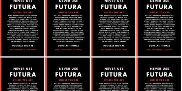
But this prohibitive attitude toward font freedom doesn’t necessarily serve us well. At least that’s the argument of Douglas Thomas, the author of Never Use Futura ― a celebratory new history of the iconic font, which does not actually condemn all uses of Futura.
“I decided to use the title in part as a provocation, and as an ironic commentary on how most of the conversation around fonts people have is housed in a negative,” Thomas told HuffPost in a phone interview. “People know not to use Comic Sans and maybe Papyrus ― those are things you just shouldn’t do. But very rarely do people understand why they should use a typeface.”
The full title of his book, Thomas pointed out, is actually Never Use Futura Unless You Are ... followed by a long list of famous people, brands and organizations that do use the typeface. (A few of the notable Futura users, listed on the front and back of his book, include: Nike, Fox News, Ikea, Vanity Fair, Politico, Forever 21 and In-N-Out.)
“I’m hoping to poke a little fun at that sort of conversation ― designers can say, ‘oh, the masses shouldn’t use Futura, but we can, in these ways,’” he added.
People know not to use Comic Sans and maybe Papyrus ― those are things you just shouldn’t do. But very rarely do people understand why they should use a typeface.
Douglas Thomas
This hypocritical anti-Futura rhetoric suggests that maybe the problem isn’t bad font choice ― it’s that designers just want to keep the good fonts to themselves. Does this sound paranoid? OK, maybe so. But there’s a grain of truth there, too. And understandably so: Overuse of a font isn’t just annoying, it can make the font less useful to designers.
We naturally associate fonts with the ideas and brands we’ve seen them presenting or adjacent to in the past. “Futura started out as this avant-garde idea,” Thomas pointed out. “It was linked with some of the newest, most cutting-edge ideas in Europe.”
Created in the 1920s by German Bauhaus designer Paul Renner, Futura was meant to capture the modernism of the time. It was closely linked with progressive political and cultural ideals ― equality, democratization, globalism and even socialism. “When Vanity Fair first used it in 1929, people were appalled,” Thomas told HuffPost. “There were editorials written calling this a Bolshevik revolution.” Not only did the magazine use all lower-case for article heads at first ― a clear attack on hierarchies and an endorsement of anarchy, in the eyes of more conservative onlookers ― the font itself was freighted with political meaning.
Then, well, everyone started to use it, and that changed the font’s impact. When we see Futura now, we probably think about Wes Anderson films or Kate Spade or Vogue ― the fact is, as Thomas recently wrote for Fast.Co, it’s a font that’s been linked to a lot of concepts, political movements, media outlets and corporations. Merely by the fact of the font’s widespread use, it’s necessarily been sapped of its power to convey strong ideas.
“In graduate schools and high-end design firms, there’s this constant search for new typefaces that aren’t being used that can be filled with new ideas and aren’t linked to past moments and movements,” Thomas said. Sometimes brands or publications achieve that by designing their own exclusive typeface, like the New Yorker’s Irvin.
That doesn’t mean Futura is no longer a good font, or that it’s never appropriate to use. Most of us don’t go to design school, but that doesn’t mean we can’t learn more about how to use fonts. We just have to pay attention to what different typefaces convey and what effect they’ll have. For example, said Thomas, when people use Comic Sans in a professional setting, they usually convey the wrong tone.
“It just seems both completely inappropriate and maybe showing a lack of judgment, the same way we’d judge someone if they stepped out of their house naked. Maybe we’re all fine with people choosing how we want to dress, but there are,” he added, “times and places for things.” Comic Sans isn’t inherently bad, though. “If it’s being used in a communication to a preschool group or in a comic book, for crying out loud,” he said, “it would be perfectly appropriate.”
See, every font has its purpose. Probably. (We still haven’t decided about Papyrus.) “Every typeface has its own voice, speaks in its own language,” Thomas concluded. “Once you understand what that language is, you can use it in exceptionally insightful and beautiful ways.”
We just have to take the judgment away from the process, stop talking about what fonts can’t do, and start embracing what they can do.